transition
CSS3 过渡是元素从一种样式逐渐改变为另一种的效果。
要实现这一点,必须规定两项内容:
- 规定您希望把效果添加到哪个 CSS 属性上
- 规定效果的时长
语法:
transition: property duration timing-function delay;
属性:
| 值 | 描述 |
|---|---|
transition-property |
规定设置过渡效果的 CSS 属性的名称。 |
transition-duration |
规定完成过渡效果需要多少秒或毫秒。 |
transition-timing-function |
规定速度效果的速度曲线。 |
transition-delay |
定义过渡效果何时开始。 |
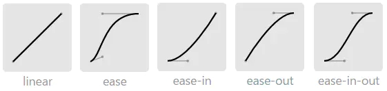
1 transition-timing-function
transition-timing-function过渡函数,有linear,ease,ease-in,ease-out,ease-in-out,cubic-bezier(n,n,n,n),steps。其实它们都是贝赛尔曲线。如下:
可以通过工具网站(如贝赛尔立方)上自动生成想要效果的贝赛尔函数代码。
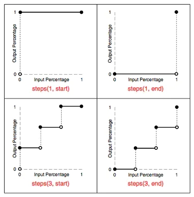
2 timing function: steps
steps可以把过渡阶段分割成等价的几步:
steps(<integer>[,start| end]?)
<integer>:用于指定间隔个数(该值只能是正整数)- 第二个参数可选,默认是end,表示开始值保持一次,若参数为start,表示开始值不保持
steps函数有两个参数,第一个参数是分割的数量,第二个参数可选,是关键字start,end,不设的话默认是end。因此steps(4, start)等价于step-start(4),steps(4, end)等价于step-end(4)
end和start的区别:
end:保留当前帧状态,直到这段动画时间结束(保留当前帧,我们可以看到第一帧在,最后一帧不在)。可以添加在后面添加forwards(保留时的100%状态)start:保留下一帧状态,直到这段动画时间结束(保留下一帧,我们可以看到第一帧不在,最后一帧在)
例子:
<style>
div
{
  width:100px;
  height:100px;
  background:yellow;
  transition:width 2s, height 2s, transform 2s;
}

div:hover
{
  width:200px;
  height:200px;
  transform:rotate(180deg);
}
</style>
<div id="transition-example"></div>
animation CSS3 动画
CSS3 @keyframes 规则
如需在 CSS3 中创建动画,您需要学习 @keyframes 规则。
@keyframes 规则用于创建动画。在 @keyframes 中规定某项 CSS 样式,就能创建由当前样式逐渐改为新样式的动画效果。
当您在 @keyframes 中创建动画时,请把它捆绑到某个选择器,否则不会产生动画效果。
通过规定至少以下两项 CSS3 动画属性,即可将动画绑定到选择器:
- 规定动画的名称
- 规定动画的时长
div
{
  animation: myfirst 5s;
}
动画是使元素从一种样式逐渐变化为另一种样式的效果。
您可以改变任意多的样式任意多的次数。
请用百分比来规定变化发生的时间,或用关键词 from 和 to,等同于 0% 和 100%。
0% 是动画的开始,100% 是动画的完成。
为了得到最佳的浏览器支持,您应该始终定义 0% 和 100% 选择器。
@keyframes myfirst
{
  0%   {background: red;}
  25%  {background: yellow;}
  50%  {background: blue;}
  100% {background: green;}
}
语法:
animation: name duration timing-function delay iteration-count direction;
属性:
| 值 | 描述 |
|---|---|
@keyframes |
规定动画 |
animation |
所有动画属性的简写属性,除了 animation-play-state 属性。 |
animation-name |
规定需要绑定到选择器的 @keyframe 名称。 keyframename|none |
animation-duration |
规定完成动画所花费的时间,以秒或毫秒计。默认是 0 |
animation-timing-function |
规定动画的速度曲线。默认是 “ease” |
animation-delay |
规定在动画开始之前的延迟。默认是 0 |
animation-iteration-count |
规定动画应该播放的次数。默认是 1 n|infinite |
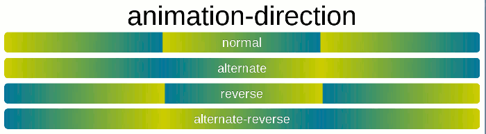
animation-direction |
规定是否应该轮流反向播放动画。默认是 “normal”。 normal|alternate|reverse|alternate-reverse |
animation-play-state |
规定动画是否正在运行或暂停.默认是 “running”。 running|paused |
animation-fill-mode |
规定对象动画时间之外的状态。 |
<!DOCTYPE html>
<html>
<head>
<style>
div
{
  width:100px;
  height:100px;
  background:red;
  position:relative;
  animation:mymove 5s;
}

@keyframes mymove
{
  from {left:0px;}
  to {left:200px;}
}
</style>
</head>
<body>
  <div></div>
</body>
</html>
animation的各项属性:
div:hover {
  animation: 1s 1s rainbow linear 3 forwards normal;
}

div:hover {
  animation-name: rainbow;
  animation-duration: 1s;
  animation-timing-function: linear;
  animation-delay: 1s;
  animation-fill-mode:forwards;
  animation-direction: normal;
  animation-iteration-count: 3;
}
keyframes:
@keyframes rainbow {
  0% { background: #c00 }
  50% { background: orange }
  100% { background: yellowgreen }
}